Your choice of app to run your business should just work…and work well.
As a business owner, you understand that running a business requires much of your time and brain power already. So, why would you choose tech that slows you down or consumes your time?
The tech powerhouse, Apple, has this figured out and it’s easy to see why they are often heralded for the best designed products and apps on the planet.
That’s why Lnvo utilizes leading-edge design that is seen throughout Apple’s iPhone operating system. Lnvo pairs these best UX/UI design principles with cutting-edge technology to empower your business and become your ultimate tool for success.
Simple and Clean Design
The best forms of design and technology are the ones that work without requiring you to do much thinking at all. This is one of the biggest reasons why Apple employs a simple and clean design philosophy throughout its operating systems (especially on the iPhone).
Lnvo’s UX/UI (User Experience/User Interface) employs design that is elegant, modern, and straightforward. It’s like looking at a beautifully organized room, where everything has its place.
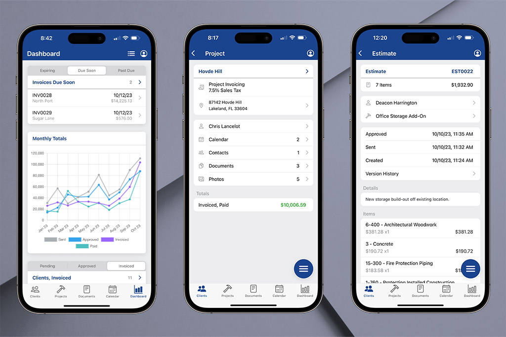
When using Lnvo it’s easy to see and separate the info you need at-a-glance for your business. Each client and project has their own folders or cards. Every detail you need is presented in a way that’s accessible, but not overwhelming. In other words…it just works and it works well.

Consistency Across Features
One of the most overlooked principles is consistency across design. If you look at an iPhone you’ll see the same design elements and stylings carried across every part of its interface.
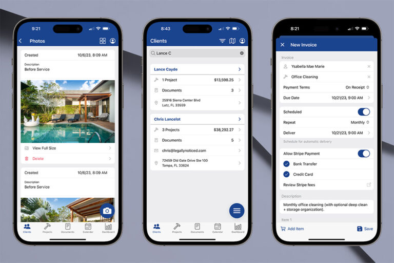
Lnvo keeps consistency top of mind for every business interaction you need. Whether you’re creating an estimate, scheduling a project, or sending an invoice, the process is similar and easy to understand.
In fact, Lnvo employs simple and recognizable icons to represent the actions and details you need the most. Plus you’ll see the same colors used for similar items and actions throughout the app’s design. This makes everything easier to learn, more familiar, and easier to use.
User-Friendly Speed & Efficiency
Getting around on your phone has no doubt become second-nature in a lot of aspects. Lnvo takes this approach with ease of navigation being a top priority.
Finding what you need should not buried in a sea of confusing options. That’s why Lnvo creates five major buckets for everything you need for your business: Clients, Projects, Documents, Calendar, and Dashboard.
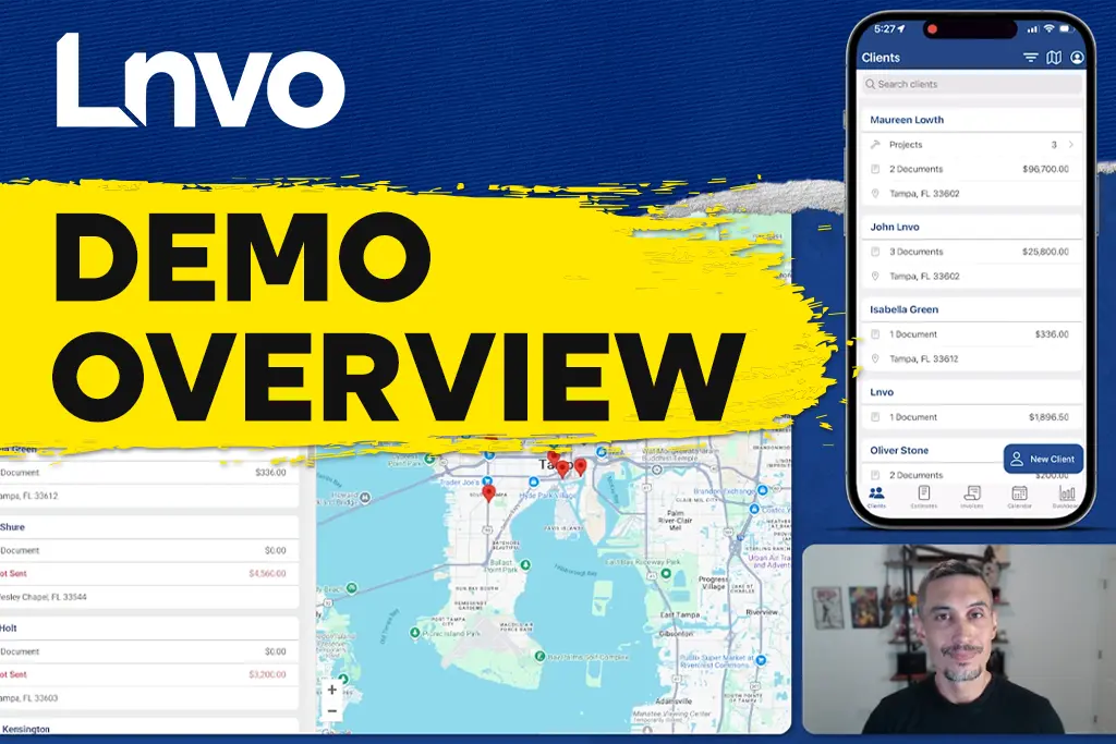
And, every part of your business is organized like a nice and neat filing cabinet. Documents find a home in their respective projects and each project is housed inside a client. Plus every piece of information can easily be searched, filtered, or sorted to your needs.

Make It Look Good
You never get second chance to make a great first impression. Beyond making an app feel good, it has to look good too. Great design utilizes the clean and modern details we expect. Lnvo takes that and expands it to every action and flow necessary for your business.
Not only does Lnvo look great in your hands as you collect payments for your business, but also looks great in the hands of your client. Whenever you send a client an estimate or invoice, you’ll also be sending them a Client Portal link that allows them to review all their projects, approve any estimates, and pay any invoices.
That means any notes and photos you include are not only at your fingertips, but also ready for your client to look over. Great design is great when it works for you and even better when it also impresses your clients.
You stand out as a professional and a leader in your industry. All because you chose the best in leading-edge design and technology with Lnvo.


